
Vintage Soft Tones + Faded Blanched Rugs
Tone on tone carpets strike a cord with us, especially those that are sunned and faded. A seemingly completely washed-out rug may appear absent of design from the light side from a distance.
However, a walk just a few steps closer to one end and the story may change. Go around from that end to one of the nearest corners, perhaps the hint of an intricately woven pattern may be slowly exposed.
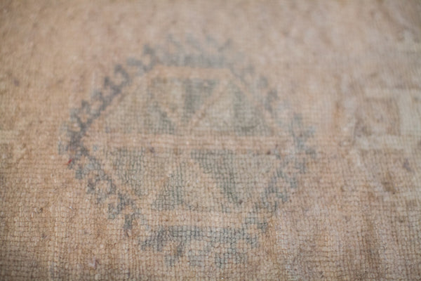
Continue circling a corner to one full side, the design and tones may pop a bit more. Go all the way around another corner 180 degress from where you were, standing at the other end of the carpet, you see the full contrast and maximum depth of colors. Light is now being absorbed into the tips of the cut wool pile, and you are seeing full saturation.
If you are able to distinguish the subtle differences in faded earthen colors and pastel tones at the first corner rounded, you've probably already connected with the piece. To some, there is nothing to be seen. In a true tone-on-tone rug, these soft, subtle differences will be detected by keen color awareness within the first few seconds. If the subtleties can be perceived that quickly, you are identifying well with the rug!
It never ceases to amaze us how shimmering gold or predominantly ivory carpet has almost completely changed based on the unique character of hand knotted rugs. A soft lemon-beige may transition into a saffron-gold. A silver grey may transition into a dark charcoal black. A few delicate faded and blanched pastels such as a pale seafoam green or soft baby blue are clearly delineated as a livelier oxidized copper, or shade of near aqua. The carpet looks like it was kissed by the sun on either side, and it is gorgeous!

Decorative carpets evoke a feeling or emotion. We select all rugs in our shop because each has a place in our decorative dreams.
For us, a faded or blanched carpet brings us to a calming place. Rugs softened in tone have a relaxed way about them. Sometimes you just need a hint of something to get the full sense of it: Like water with a hint of lemon instead of a full-on lemonade. With a tone-on-tone carpet, you get the true sense of a color: How might a shade stretch when diluted in saturation? To what extent may pigment be drawn down before you lose the essence of the shade.
Identifying and embracing with the sensation of connecting to a shade or even adjacent shades (such as just one area of a rug) is part of the process of finding the right rug. The appreciation may just start with the love for how two colors seem to co-mingle as they buffer each other around an intricate design as outlines thin and thicken. Perhaps that identification is just in small hand-size area. It almost does not matter if the rug has a medallion or is an allover design, you may just find many areas where some field and outlines just have a harmony about them.

We look forward to introducing a few room size rugs in the upcoming weeks. These carpets draw upon the character of tone-on-tone with soft bursts of wooded browns and pastels in "sun kissed" fade.
David + Melissa
Comments